
There are three main parts to a basic Homepage: the Header Content area, the Footer Content area, and the Main Content area.
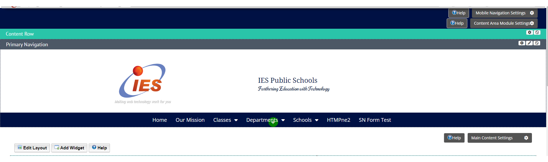
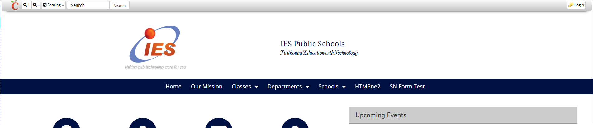
This is the Header Content area. It usually contains your Primary Navigation and Secondary Navigation if you have one. It can contain much more as Content Rows can hold any kind of widget you want and you can add, delete, and format as many content rows as you want. But at its most basic, it will usually contain a Primary Navigation Widget that will allow you to display and configure design settings for your Primary Navigation (your main menu ) and that row will usually be set to show on all pages. You can find more information on content rows here.
It’s important to note that widget and content rows that are made up here need to stay up here. If they are dragged into the Footer Content Row area or dragged in the Main Content area then error may occur on your page.
There will be two gray buttons on the top right when you are logged in. These are the Mobile Navigation Settings and Content Area Module Settings. Mobile Navigation Settings will control how your menu shows when it is being viewed on a phone in a browser. It will always be a sandwich menu (three horizontal lines stack on each other) but you can change the colors. This can also be done in the Primary Navigation menu if you are on a template that has content row.
The other button is Content Area Module settings; this button controls the site background.
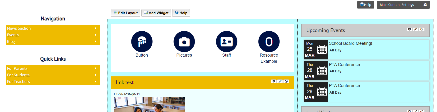
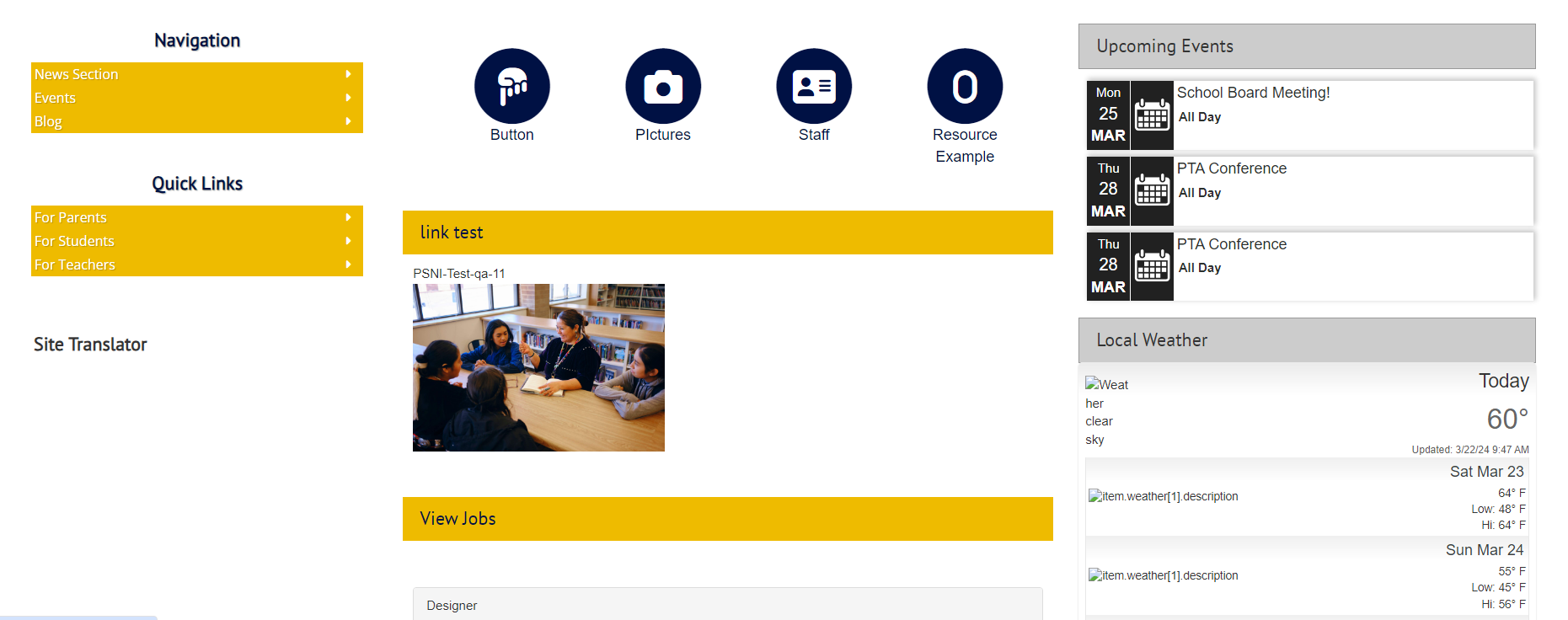
The next part down is the Main Content area. This is where you can add widgets and it works very much like a portal, if you already know how to use those. If you don’t, you can find out more here. The button here that says Main Area Content Settings controls the setting for basically everywhere that light blue portlet areas appear and the appearance of any side navigation menus. If you decide to go in here, IT IS VERY IMPORTANT THAT YOU DO NOT UNCHECK THE ENABLED BOX as doing so will make it look like all the content on your site has been deleted, so please do not uncheck this box. The Side Navigation Placement setting here will determine whether a side navigation is visible and if it is, where on the site does it show up and on what side. You can decide the ratio of the side navigation to content in the box under that. In the Styles tab you will be able to change how many of these elements look, such as if your departments will have their own backgrounds and the different colors of the other parts. If you go to Styles > Dimensions you can also decide if you want a Fullwidther look ( content will try to fill as much space as possible horizontally) or containerized ( content will be constrained to the middle of the page.) There are some other settings here but these are the important ones.
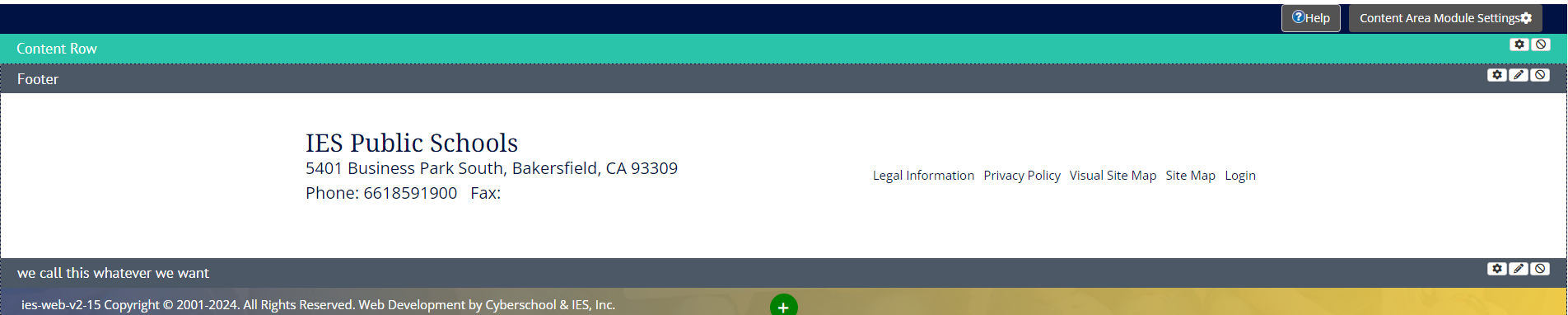

The last part of the page is the Footer Content area. It is very similar to the Header Content Area but it is on the bottom of the page and will generally contain a Footer widget and the Copyright widget. As with the Header Content area, content rows and widgets that are made down here need to stay down here. The Footer widget will generally contain things like school’s address and contact information, there is optionally some layouts here that will allow you to display Legal Information, Privacy Policy, both a Visual and non Visual Site Map, Login button, and video/images. The Copyright Widget will contain our copyright info to the site and server information that we may ask about during troubleshooting.